
The Customization Settings section of the Woo Price Logger plugin allows you to fine-tune the appearance and behavior of the price chart. These settings give you granular control over how the chart is displayed on your website, ensuring it matches your site’s design and user experience. Please note that settings on the product page take precedence over shortcode settings, which in turn take precedence over the global settings configured here.
Chart Type:
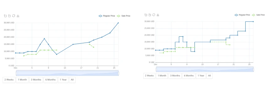
You can choose between two chart types: Step (a step-like line graph) and Line (a smooth line graph).
Direction
You can choose the direction of the chart using the options:
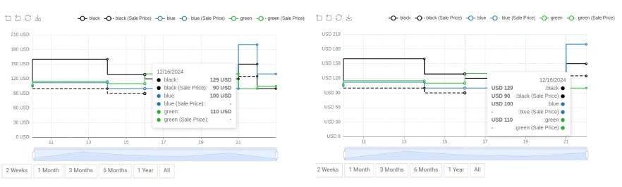
Chart Height:
Set the height of the chart in pixels. The default height is 400px. This allows you to adjust the vertical size of the chart to better fit your layout.
Color Options
- Regular Price Color: Select the color you want to use for the regular price line on the chart. You can choose a color using a color picker or by entering a hex code.
- Sale Price Color: Select the color you want to use for the sale price line on the chart. You can choose a color using a color picker or by entering a hex code.
Display Options

- Smooth Mode: When enabled, this option displays the chart with a curved format for a smoother visual appearance. If disabled, the chart will display sharp transitions between data points.
- Area Mode: When enabled, this option fills the area between the chart’s axis line and the data line, highlighting the trends in the chart.
- Show Toolbox: When enabled, this option adds a toolbox to the chart, providing tools for saving the chart as an image, zooming in and out, and other interactive features.
- Show Legend: When enabled, this option displays a legend on the chart, showing the symbols, colors, and names of the different data series, for example: “Regular Price” and “Sale Price.”
- Show DataZoom: When enabled, this option allows users to zoom in on a specific area of the chart by using a slider or by using their mouse.
- Show Xaxis Label: When enabled, this option displays the x-axis labels in the chart, showing the dates.
- Show Yaxis Label: When enabled, this option displays the y-axis labels in the chart, showing the price.
- Show Grid: When enabled, this option displays grid lines on the chart, making it easier to read and interpret the data points.
- Show Buttons: When enabled, this option displays time range buttons (e.g., 2 weeks, 1 month, 1 year) below the chart, allowing users to filter the displayed data based on these time ranges.
- Show Sale Price: When enabled, this option displays the sale price data on the chart.
- Min/Max Regular Price: When enabled, this option displays markers for the maximum and minimum regular prices within the displayed timeframe.
- Average Regular Price: When enabled, this option displays a line showing the average regular price over the displayed timeframe.
- Min/Max Sale Price: When enabled, this option displays markers for the maximum and minimum sale prices within the displayed timeframe.
- Average Sale Price: When enabled, this option displays a line showing the average sale price over the displayed timeframe.
- Symbol Size: Set the width and height of the marker for Min/Max Prices option. The format is “width,height”. For example: 90,20